
HSBC
Increasing staff efficiency in branch
The challenge
Design a tablet application for HSBC branch staff to increase their efficiency, productivity and provide a better customer experience.
The outcome
Time for previously paper-based processes have been cut in half, increasing branch and customer relationships and data management.
Key user journeys within the application designed and validated creating one consistent experience.
The application enables staff to remove barriers and serve customers shoulder to shoulder.
My role
Discovery research
I conducted discovery research with HSBC branch staff, different banks and also staff of non-financial stores to see how they were currently using tablets in store.
Concepting
I came up with solutions to problems. Presenting my solutions to the stakeholders, seeking feedback and iterating, and persuading where necessary.
Technical flows
I created complex flow diagrams for a range of user journeys within the application. Detailing the branch staff and customer journey, as well as technical details.
Design execution
I designed both UX and UI output for a range of user journeys completed by bank staff.
Testing and iterating
I conducted user testing of concepts, wireframes and high fidelity UI with bank branch employees.
Discovery
I conducted research with branch staff through depth interviews and leveraged existing research from within the bank. Uncovering pain points and the wants and needs of bank staff when serving customers.
Competitor research was also conducted, we looked across the banking industry and tested the offerings from competitors.

In branch interviews and observations with branch staff
I also looked cross industry to see what we could learn from how other industries were using tablet applications in store.
I observed and spoke with employees of other stores to understand how they’re currently using tablets and if there was anything that could inspire my thinking.
Cross industry discovery
After synthesising the insight gathered there were five themes that stuck out more than most:
1. Speed
The application has to be able to be used at speed and be quick itself. At times staff members may have to engage and interact with a queue of 15 customers, one after another.
2. Clarity
Staff members deal with complex data, complex products and hundreds of customers daily. The application needs to be understood at a glance.
3. Smart
Have the application do the jobs banking staff dislike. Automate tedious processes and provide extra insight about customers to help staff have meaningful conversations.
4. Visibility
Staff want to know what is going on across the branch and when. From the amount of customers waiting to be seen for an appointment, to how many staff members are currently on shift.
5. Leverage the device
Use the tablet's built in functionality to save staff members having to use other tools and hardware.
The insight above played an important role throughout the project and the design process. It was also a great place to go to when we wanted to validate an idea or new functionality quickly.
“Having a solid base of research ensured we didn’t waste any time pursuing an undesirable idea”
Design, test, iterate
With a good grounding of research behind us we moved onto designing and solving the most important problems and user journeys.
The application consists of around 15 main journeys, the journeys are predominantly common tasks bank staff do day to day with customers. Both reactive and proactive tasks. For a range of different customer types and needs.
My colleagues and I split up the journeys between us and we would both design a journey until it had been fully tested and validated by bank staff.
...
Or when the Product Manager moved us on to another journey.
Unfortunately there wasn't any sprint planning during this project, or much planning in general. My colleague and I tried and tried to get a sprint plan in place but the Product Manager didn't take our advice.
“At times it was a chaotic project, but a fantastic one to learn from.”
Nonetheless, the project still delivered good outputs and outcomes. Due to confidentiality I am unable to disclose specific application functionality. However, I would love to share the design process I took.
Card sort
Before going into depth and designing pages and features of the application, I moderated a number of card sorts.
I conducted closed card sorts with bank staff and project team members who had good knowledge of branch procedures, we were lucky enough to have Business Analysts that used to worked in branch recently.

We conducted open card sorts with branch staff and Business Analysts who had recently been working in branch

Information architecture. Blur applied for privacy
Sketch the existing and then the future journey
I began each new feature by sketching the existing journeys with staff members. As we sketched the journey together we identified pain points and areas for improvement.

Collaboratively documenting and sketching the existing journeys with branch staff
This method allowed me to explore with the staff member if they had any ideas for how the tablet could enable greater efficiency at various stages of the journey as we walked through it.
I then took the existing journey and sketched underneath it various ideas for how to improve it now we had the assistance of a tablet. This became the future journey.

Sketching the ‘future journey’ with the assistance of a tablet application
I took the future journey and validated my attempts with the Business Analysts who used to work in branch.
Given the nature of their jobs and availability bank staff were not always on hand to test and provide and feedback at this stage, unfortunately.
Therefore I did as much validation as possible with the BAs. Always keeping the design output low fidelity and something I could produce quickly to ensure I didn’t waste time and effort.
“At this stage it was about quick validation to ensure we were heading in the right direction. I kept design output low fidelity which allowed me to pivot if need be”
Create the user flow
I would then create a detailed technical user flow to enable greater discussion and collaboration between the team.
It benefited the Business Analysts because it enabled them to create thorough user stories detailing every aspect of the journey. It also enabled the Technical Architect to identify what banking systems would need to be accessed and where.
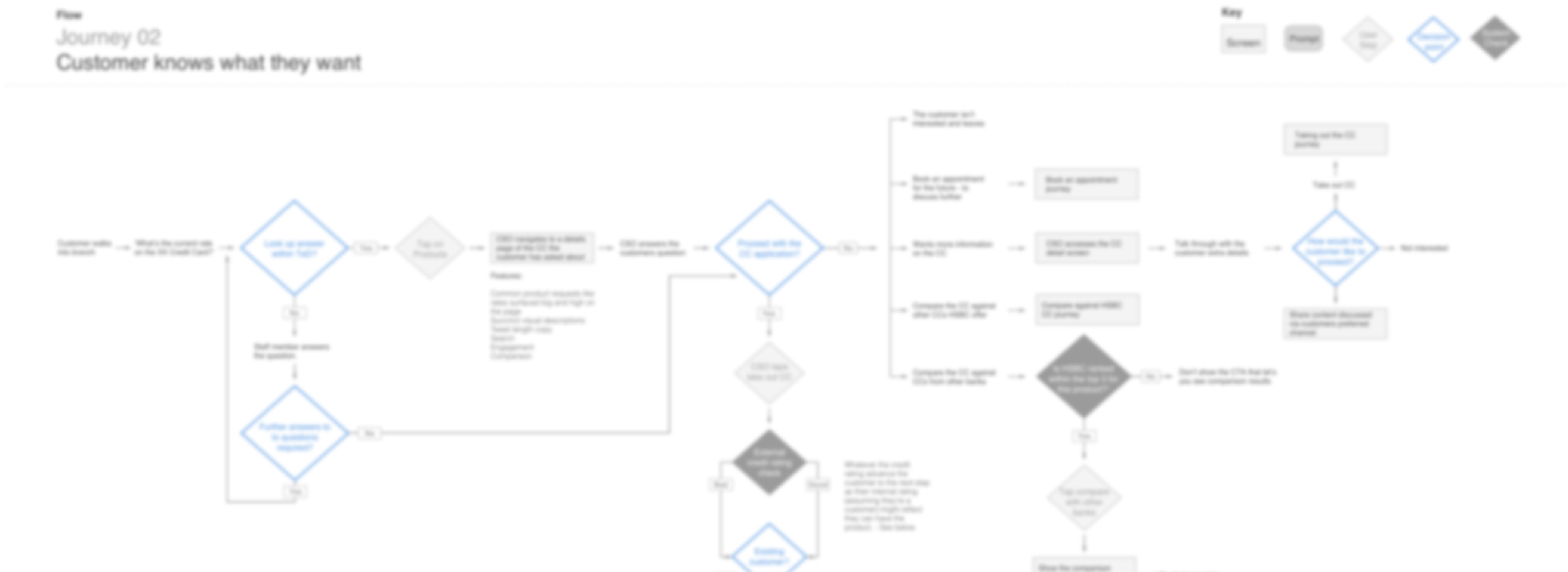
User flow, blur applied for privacy
Sketch ideas
Once the future journey were validated by bank staff and the technical feasibility validated. I moved onto sketching the various screens that made up the journey.
While observing bank staff serving customers I saw first hand how frantic and fast paced the banking hall environment is. The application needed to be clear and simple.
During the ideation process I ensured all of my sketching was done on whiteboards or paper that I then stuck up on the wall for the whole team to see. I try to follow this principle with all of my projects.

A small collection of my sketches and ideas
Before I knew it I was discussing my design rationale and taking feedback from various team members. And also from others in the bank who just happened to be walking by. I had people giving me extra insight into a journey because they knew the area so well.
I then took my work-in progress sketched variations into branch. I quickly realised the staff found it hard to give constructive feedback because of the fidelity of the design. They couldn’t imagine themselves using it in branch because it was just paper.
“Bank staff struggled to give feedback because it was just paper sketches, it wasn’t tangible enough for them. From then on I upped the fidelity for testing”
From that moment on I only tested low fidelity wireframes with staff members which I placed on a tablet.
Staff members instantly wanted to interact and explore, this format gleaned much richer insight than the paper sketches.
Wireframe
I then took the most well received sketches and created low fidelity wireframes. I kept the wireframes greyscale to ensure the bank staff during testing didn’t get caught up in the aesthetics.
Testing the wires with staff members produced much better results, the wireframes gave greater realism and were easier for participants to understand than sketches.

A selection of wireframes covering multiple journeys
Interactive prototype
To give the product even greater realism I created an interactive prototype that over many weeks took on more and more user journeys. Over time the fidelity also increased as we got closer and closer to a final solution.
The process above was what I followed when designing various features and journeys of the application that I was tasked with. I also got involved with visual design exploration, helping shape and define the visual language of the application.
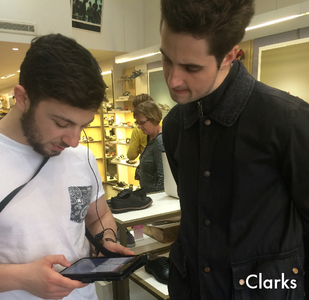
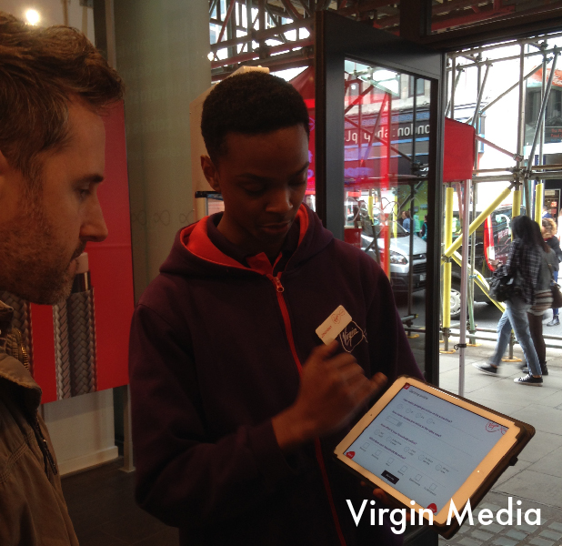
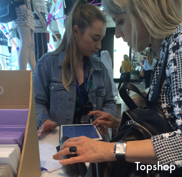
User testing
I tested with bank staff through every major milestone.
Throughout the early stages of the project the Product Manager was extremely reluctant to engage in user testing. They thought it was a waste of time and would bring little value.
“The Product Manager was extremely reluctant to engage in user testing”
In 3 months the Product Manager organised two badly run and very short sessions with employees of HSBC.
That didn’t suffice with me. I wanted to set up weekly testing so we were constantly iterating and moving forward.
“That didn’t work for me. I wanted to set up weekly testing so we were always iterating and moving forward towards the desired outcomes”
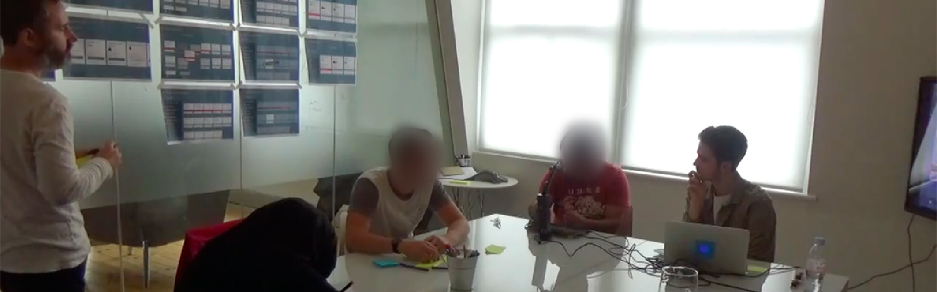
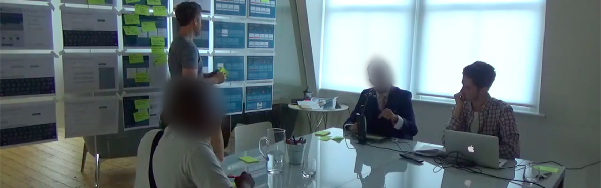
My colleague and I took matters into our own hands. With the permission of the Product Manager we recruited bank staff and in our own time after work ran user testing and co-design workshops.
We had weekly sessions for seven weeks with staff from a range of retail banks.
“In our own time after work we ran user testing and co-design workshops with bank branch staff”

Overview of our user testing efforts with branch staff
The set up
I took responsibility for the creation of discussion guides to aid conversation between the bank staff.
I set tasks for the bank staff to complete using the prototype on the tablet. Asking probing questions, exploring their wants and needs and the usability of the application as they completed the tasks.
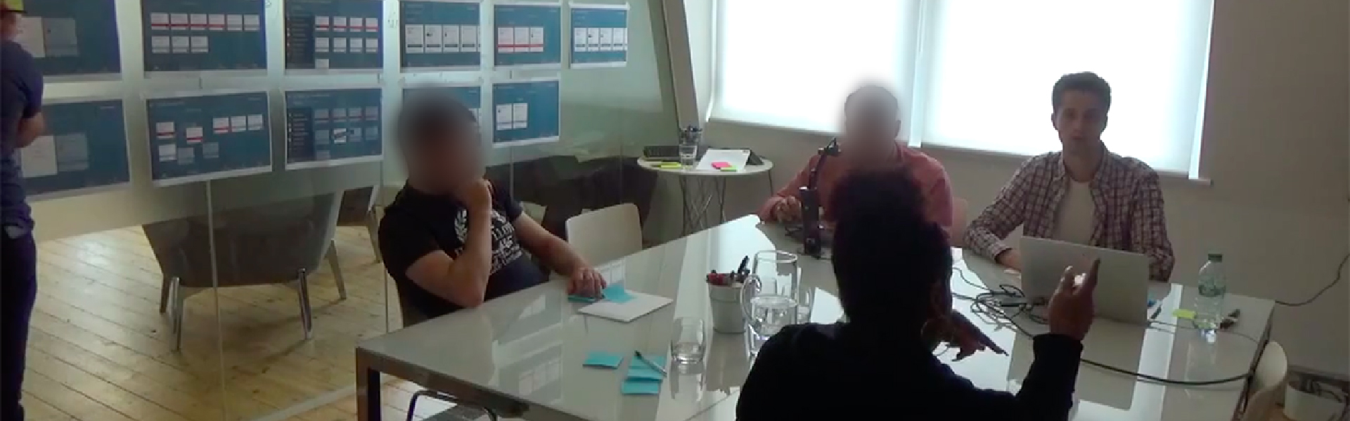
Moderating user testing with branch banking staff
“I’m glad you did the testing, it's been a useful and worthwhile exercise. You proved me wrong."
Product Manager
Post testing
The morning after each testing session I took on the responsibility to play back what happened to the wider team. I then facilitated discussion between team members about iterations that needed to be made.
When we agreed what changes we wanted to make I led a prioritisation exercise in which as a team we decided where the changes should sit in the backlog.
Outputs and outcomes
We left the internal team with a range of journeys designed, a clear plan of what to tackle next and why, and a culture of testing, iterating and learning from failures.
Designed and validated application
I designed a range of user journeys, the full end to end user experience. Validated by the banks employees and a number of envious employees from other retail banks.
Information architecture
I designed and validated the information architecture. One that allows staff members to easily find what they’re looking for and cut the time it takes for them to find something.
Interactive prototype
I created a high fidelity interactive prototype covering major features and a range of the most important user journeys.
User journey flows
I created flows detailing the branch staff experience, customer experience and technical considerations. The flows enabled Business Analysts to outline user stories and requirments.
Future scope planned
I identified and prioritised over 40 more user journeys to be built. The bank can use this to add more functionality to the application so their staff members are fully supported.
Roll out
The application is being piloted in 3 London branches in May 2017.

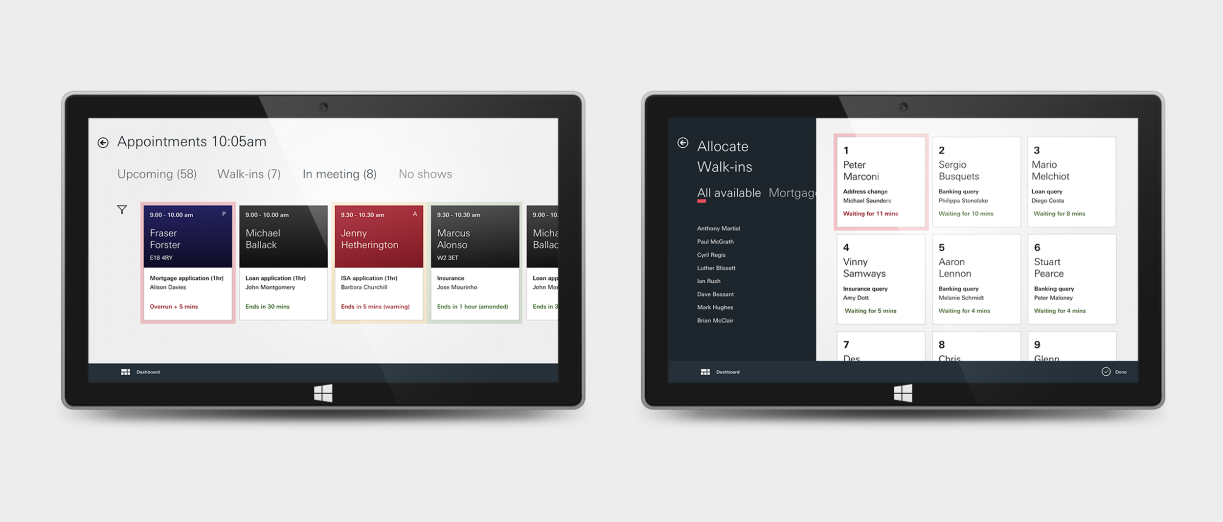
Staff have an overview of all upcoming customer appointments and information about the customer

1. Staff can check at a glance all meetings that are in progress and there status
2. View all walk-ins. Staff can see how long customers have been waiting and can assign a free member of staff to help
Future thinking
Towards the end of the branch application project our client asked my colleague and I to take a week to look into the future of how in branch literature will be communicated and presented to customers in branch in the future.
The output of our research and thinking were two journey maps.
Journey 1 - Saving money for the future
James and Sarah have a new baby on the way, they need to get their financial matters in place and get saving to support the baby as it grows. Through an interactive life planning tool James can create his own financial milestones which he’ll need to support the baby.
Alongside assistance from HSBC James and Sarah are able to plan effectively, ensuring they’ll have the right amount saved for each major life milestone.

Future user journey - Saving money for the future
Journey 2 - Inherited money
Pete is a young man who was just inherited a large sum of money. Money he wishes to one day put towards his future, Pete needs his money working hard for him.
Through interacting with HSBC both in and out of branch Pete is able to build up a clear picture of how is money may grow over time and which savings account is right for Pete.
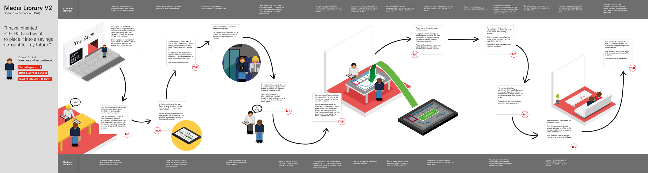
Future user journey - Inherited money and investing
Learnings
This was a particularly challenging project working with a challenging Product Manager under some unique circumstances. But a fantastic one to be involved in as I took away many learnings.
Strive for agile methods
Sprint plan in place from the very start. Fight harder for this to be put in place. It will benefit the product and everybody on the ground working on it.
Daily stand ups are a must. Something I organised and ran every morning after the Product Manager didn’t.
Fight for the user
Fight for user testing and involvement throughout. Keep going. It’s always worth it.
New method of user testing. Two participants observe while one participant tests the prototype. After a journey is fully tested they all give feedback, discuss and at times do a mini co-design!
Team clarity
Team dynamic. There needs to be clearly identified roles, responsibilities and split of workload. Without it things can get messy and risk work being duplicated.